MOM and DAD, Fill-In Book series
Design and Illustration/ 2025
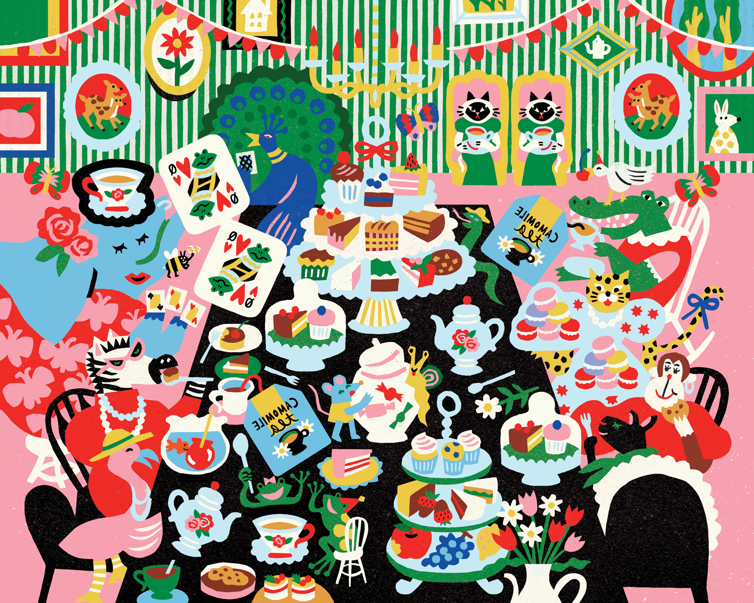
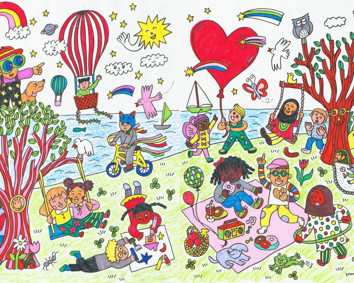
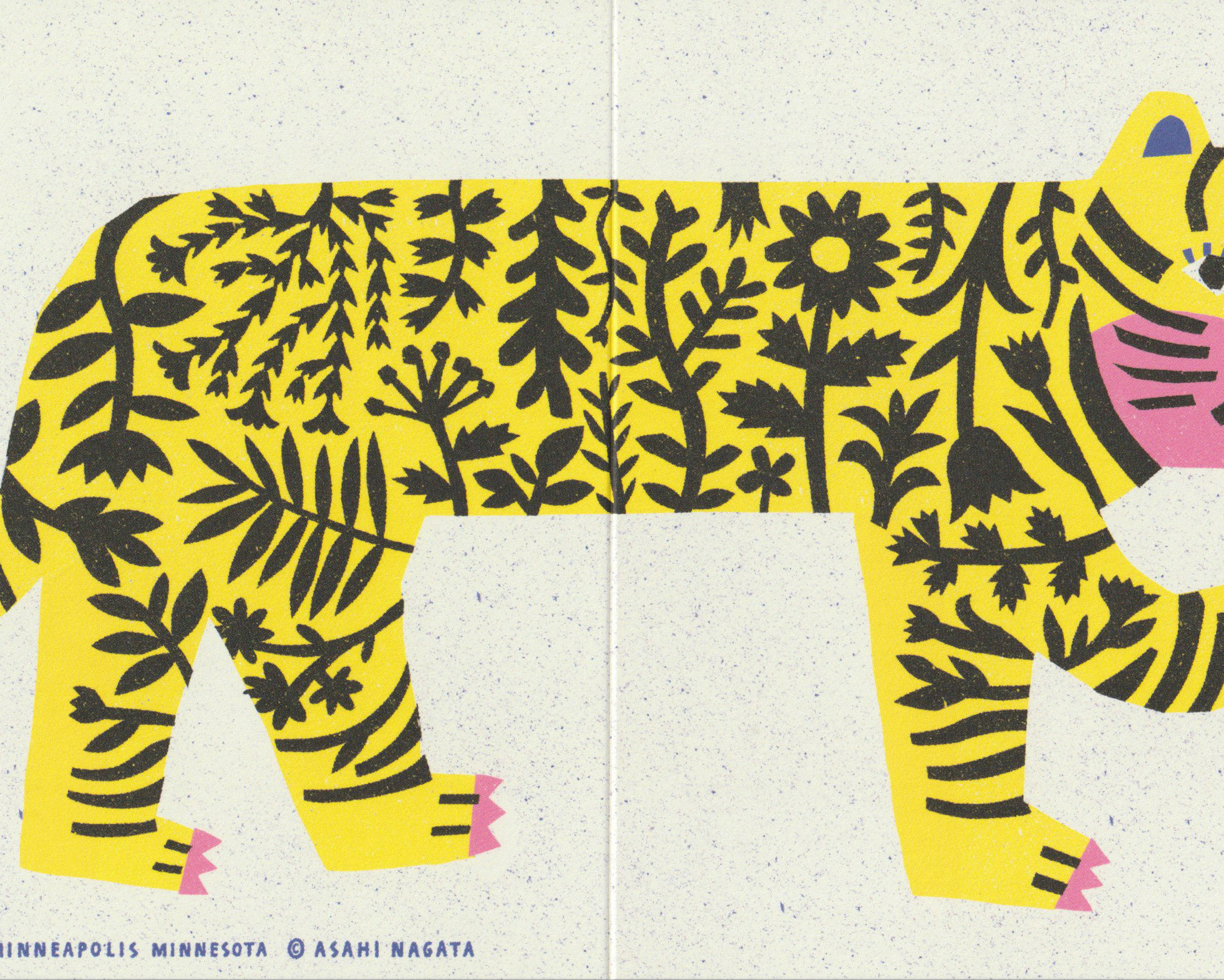
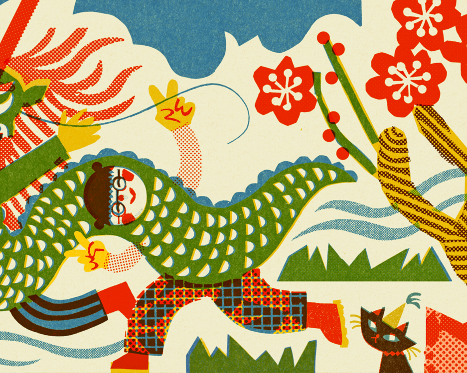
I designed and illustrated a series of interactive books called Mom, I Made You a Book and Dad, I Made You a Book through 2024. These books allow kids to draw, check off boxes, and make lists, all while celebrating what they love most about their mom or dad. Once finished, parents have a special keepsake that reflects their child's unique personality and heartfelt love. The prompts are ideal for children ages 7 and older.
The publisher, Compendium, provided the author’s script, and I began creating spread drafts with black and white pencil sketches. The first challenge was ensuring each spread had a unique layout and style. This was tricky at times because the script often repeated a similar structure—there would be a phrase, followed by "here I draw a picture of it!" next to it. I wanted each page to feel fresh and engaging, offering both fun and discovery for the person filling in the pages and the reader.
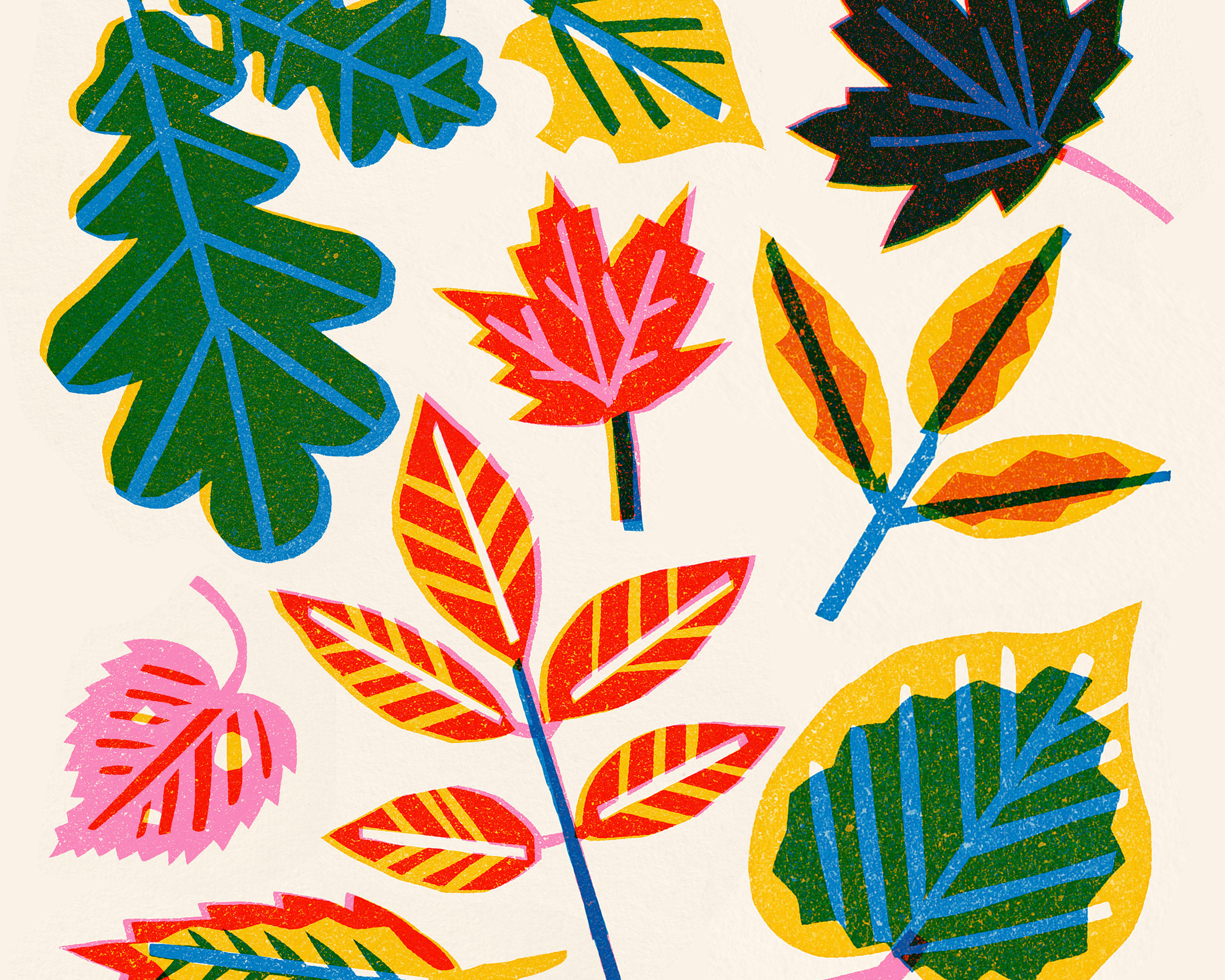
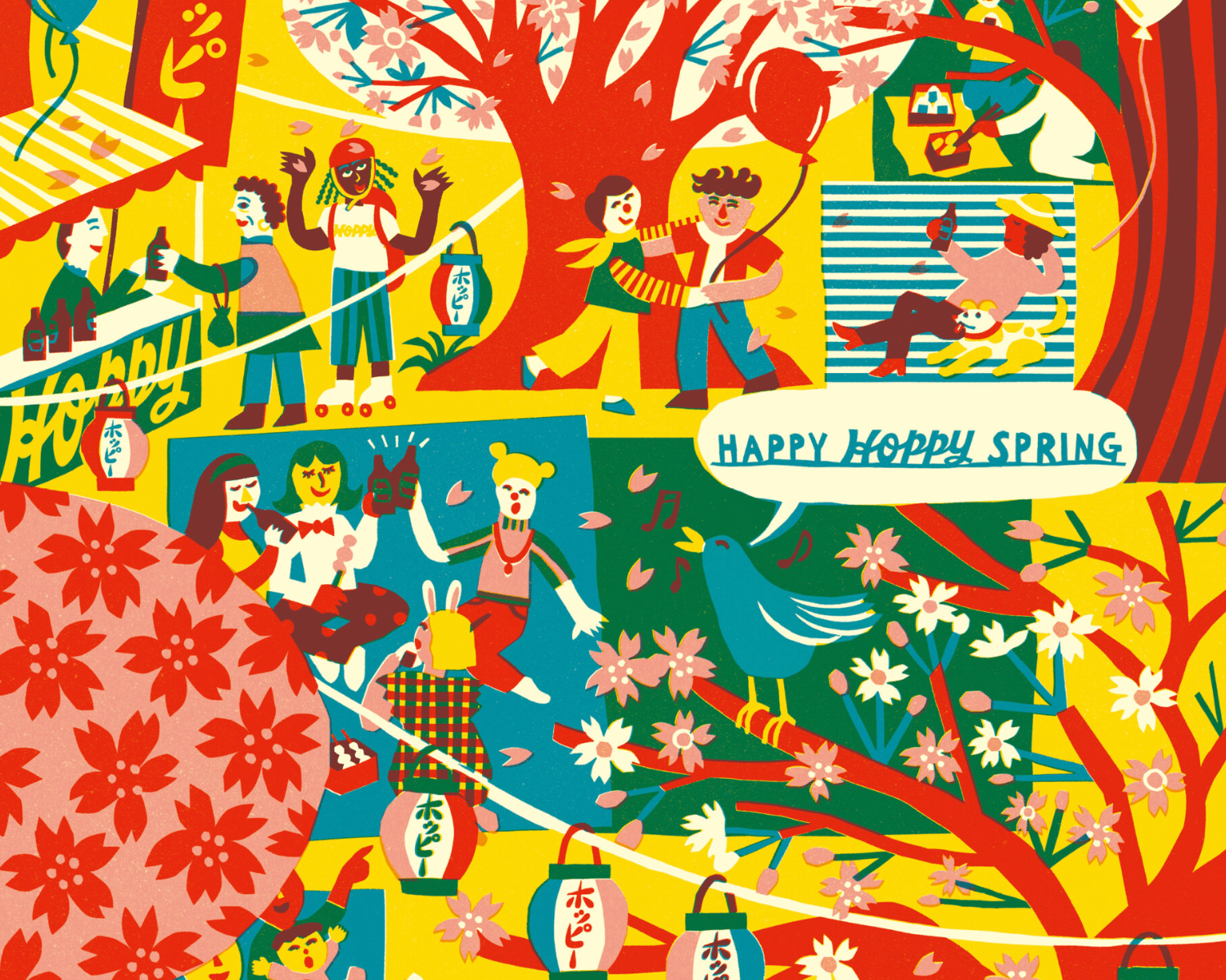
Working in a RISO-inspired illustration style made this challenge more enjoyable. I used a limited color palette of three inks—fluorescent pink, yellow, and blue—to mimic the look of traditional RISO printing. (This kind of palette is one of my favorites to work with!)
Once the layouts were set in black and white, I began experimenting with color. Even with just three inks, I made sure each spread was vibrant and dynamic, using color overlays to create a range of tones. This made each page pop as readers flipped through, and allowed the colors to interact in different combinations, adding depth and interest. Experimenting with a limited color palette is always the most exciting part of the design process for me.
Initial sketches for the spreads
The original pencil sketches featured a lot of cursive lettering, which I love for the character it adds to the design. However, the team pointed out that many young children today don’t learn cursive in school, which could affect readability. With this in mind, I chose to retain a handwritten, paper-cut style typeface. This keeps the whimsical feel of the design while ensuring it’s still easy for young readers to follow.
I felt that readability was especially important in this book, as I felt it’s a fill-in project meant to encourage kids to work independently, and feel a sense of accomplishment and independence as they complete the book on their own for their parents.
I truly enjoyed working on this project. I have a daughter who just turned 5 and has started reading and writing, and she absolutely loves any kind of art project, especially making little books. I can easily picture her filling in these pages and feeling proud of what she’s created. Her little mirrored "S" and "ILOVEYOU" written without any spacing melt my heart every time I see them. These books will be the perfect way to preserve her handwriting and make a special addition to our bookshelf.
Publisher: Compendium
Written by: Miriam Hathaway
Written by: Miriam Hathaway
Thanks for visiting!
